Proof Pages · All families
Reusable Sections
Eight sections, ready to drop in
Every section in the pack, shown in sequence. Import any one on its own, or combine them into new pages. They all share the same Divi 5 variables and presets.
Section 01
Masthead
Full-bleed hero with a proof rail. Opens any case study.
Mara Quill × Husk · Brand Identity
Husk, a Stone-Ground Identity
A bakery with a great loaf and a forgettable label got a complete identity that looks as honest as the bread.
Husk grinds its own flour and proofs slow. The branding did neither justice: a thin script, a beige bag, a logo that vanished on a shelf. I built an identity with the weight of the grain it is named for.
Client
Husk, stone-ground bakery
Engagement
Full identity, six weeks
Deliverables
Logo system, palette, type, packaging
Section 02
Snapshot and Stat Ledger
At-a-glance cards above a documented-number ledger.
Overview
The work at a glance
Where We Started
A delicate script that disappeared at thumbnail size, a beige bag lost among beige bags, no system for a growing range.
What We Changed
A heavy grotesque wordmark, a husk monogram that works at any size, a flour-and-ink palette, and packaging built to own the shelf.
What We Measured
I documented the system and its application. Sales lift belongs to Husk's own numbers, so that stays with them.
Section 03
Challenge Band
The problem stated plainly, beside a source note.
The Challenge
Great bread, invisible brand
Husk's loaf had a following. Its shelf presence did not. The old mark was a thin script that turned to mush below an inch, the bag was the same kraft brown as every other artisan label, and there was no system to hold a growing range together. The brief was simple and hard: an identity as honest and substantial as a stone-ground loaf, that works from a stamp to a storefront.
Source Material
I worked from the product itself, the shelf it competes on, the range Husk plans to grow into, and the founder's own words about the bread.
Section 04
Artifact Strip
Three captioned evidence frames in an even row.
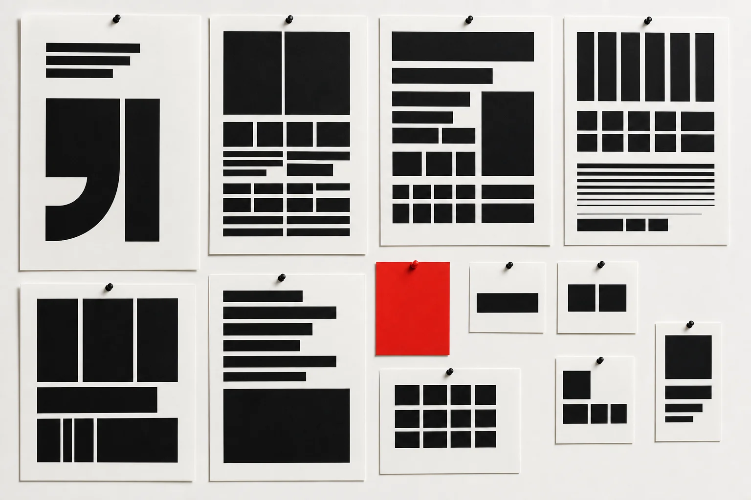
Artifact 01
Mark explorations, weights and the husk monogram
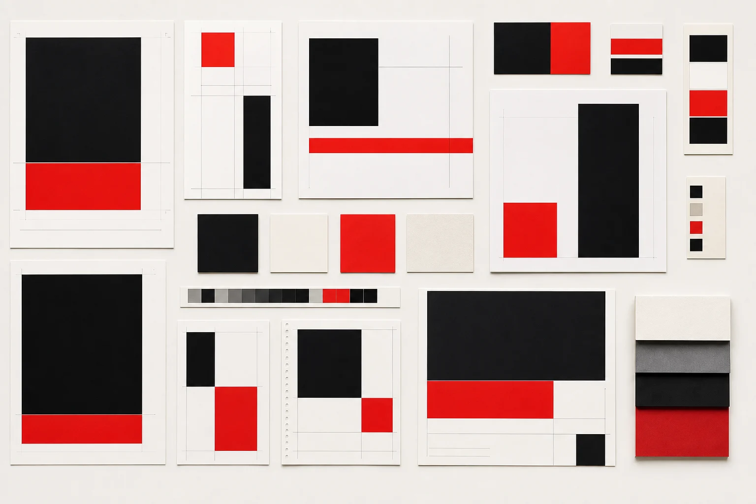
Artifact 02
The old packaging, audited against the shelf
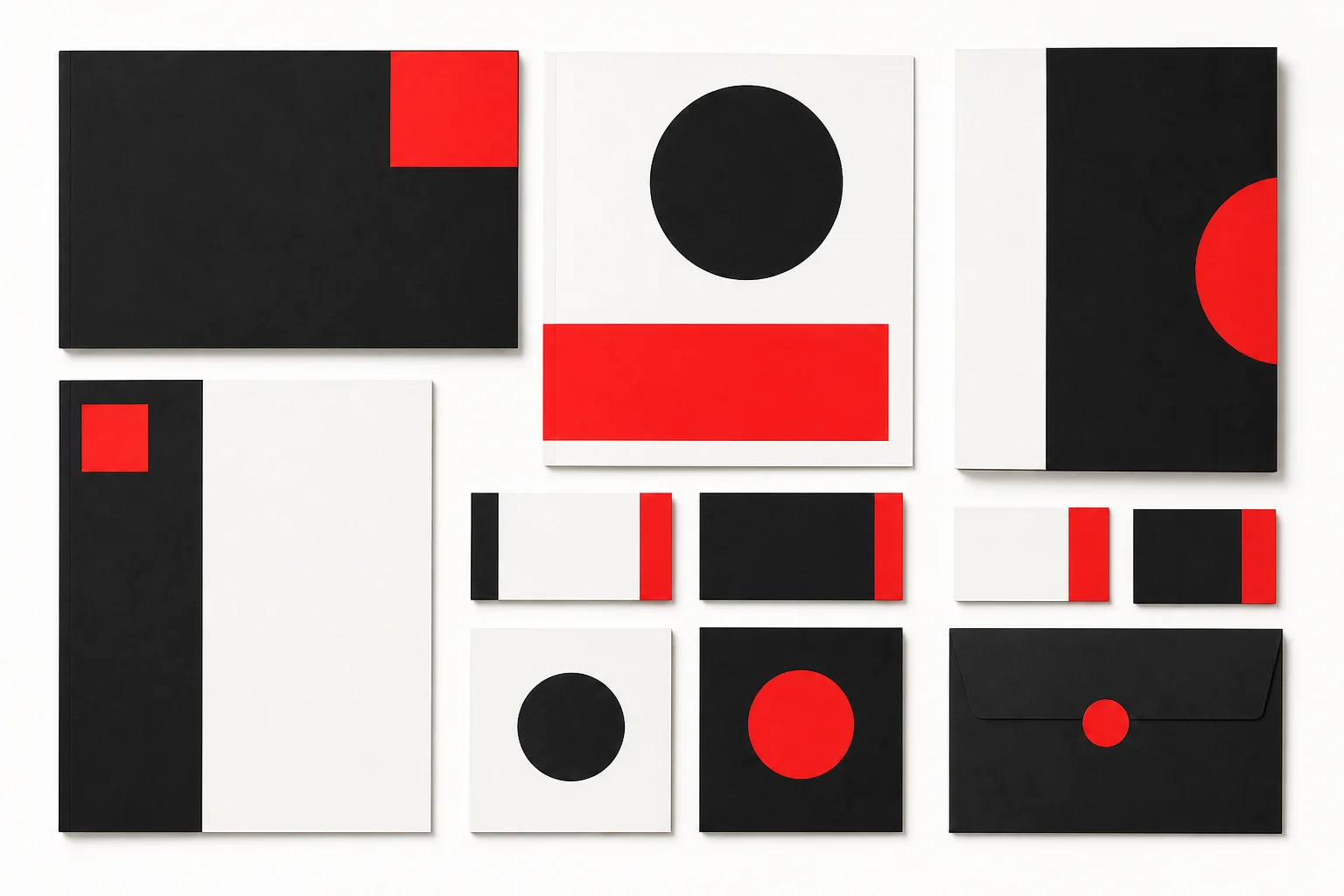
Artifact 03
Type and palette tests at real label sizes
Section 05
Process Steps
Equal-height numbered steps beside a media panel.
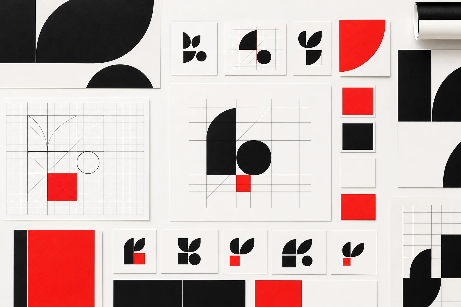
In Motion
A motion study stands in for the animated logo build.
The Approach
I built it from the grain up
I started at the smallest size the mark would ever live at, a stamp on a paper bag, and built up from there. The husk monogram came first, then a heavy grotesque wordmark to match its weight, then a flour-and-ink palette with one signal red for the range labels. Every asset was tested on the actual shelf before it was final.
1
Audited the old mark against the real shelf.
2
Drew the husk monogram for the smallest size first.
3
Built a heavy wordmark to match its weight.
4
Set a flour-and-ink palette with one signal red.
5
Applied it to a full packaging range and shipped.
Section 06
Evidence Frame
A large interface frame with supporting proof cards.
The Evidence
The brand, on one board
The system as it ships: mark, monogram, palette, type, and the rule that holds them together.
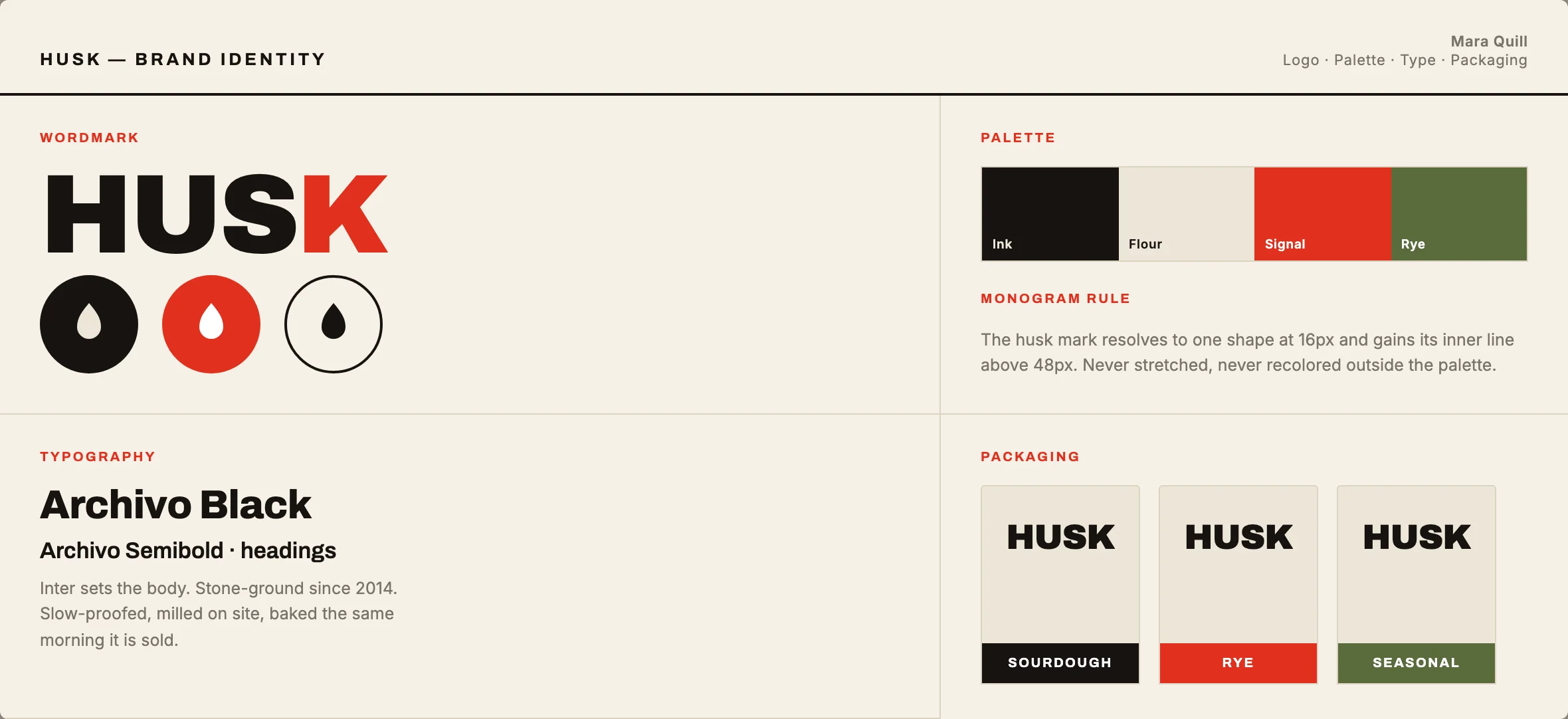
The Husk brand board: logo system, husk monogram, flour-and-ink palette with one signal red, and the grotesque type that carries it from stamp to storefront.
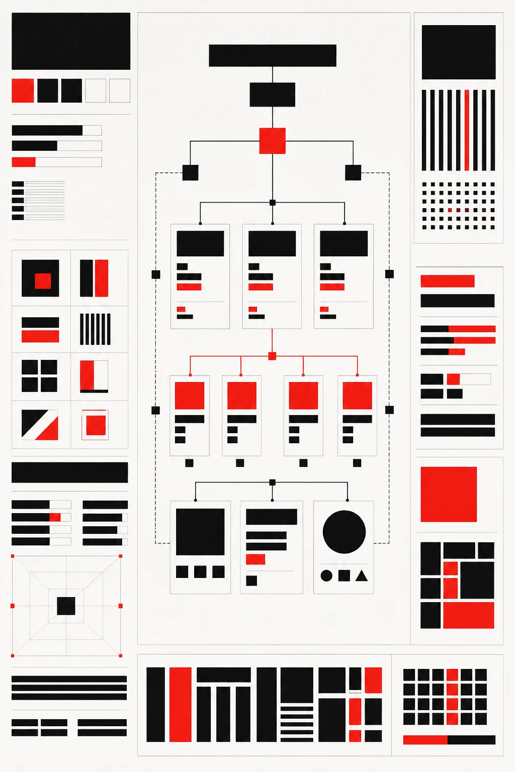
System Map
How the monogram, wordmark, and palette scale from a stamp to a shopfront.
The System
One monogram, one wordmark, one palette, one rule. Built so a new product is a five-minute label, not a redesign.
The Range
Sourdough, rye, and seasonal loaves share a frame and differ by one signal-red band, so the shelf reads as a family.
What I Did Not Measure
Sales and shelf lift sit in Husk's own numbers, not mine. I document the system; the results stay with the client.
Section 07
Quote and Outcome
A reflection closed by a spined pull-quote.
Reflection
An identity as honest as the loaf
Husk now owns its shelf with a mark you can read across the shop and a system that grows without me. The board, the explorations behind it, and the founder's note below are the record of the work.
“Mara gave us a brand with the weight of the bread. People find us on the shelf now, which they never did before.”
Founder, Husk Bakery
Section 08
Handoff and CTA Band
The design-system pitch and closing call to action.
Inside the System
Built on a real Divi 5 design system
Every color, type size, spacing step, and component on this page is a named Divi 5 variable or preset. Change one and the whole story restyles, so making it yours is an edit, not a rebuild.
Design Variables
Change one color or type scale in the Variable Manager and the entire page follows. Nothing here is hardcoded, so your rebrand takes minutes.
Element Presets
Mastheads, proof rails, evidence frames, quote panels, and buttons all run on named presets. Restyle one and every match updates with it.
Rows That Stay Even
Card rows hold equal heights no matter how long your content runs. Paste your real copy and the layout keeps its shape on every screen.
Ready For Your Story
The sample case study, labels, and images are isolated for clean swaps. Drop in your own work without untangling a single style.