Proof Pack · All families
Northsight × Lumen · Homepage
Lumen Homepage Redesign
A homepage that listed everything became one that answers the visitor's first question above the fold.
Lumen had a feature-rich product and a homepage to match: nine sections, four CTAs, no clear first read. We rebuilt it around the one question a first-time visitor actually asks.
Client
Lumen, analytics platform
Engagement
Homepage redesign, three weeks
Scope
Message, layout, and a build-ready page
Overview
What three weeks documented
We read the homepage the way a first-time visitor does: five seconds, one question, ready to leave. The answer to what is this and is it for me was buried under nine equal sections. We led with it, ordered the rest behind it, and shipped a page the team could maintain.
3
Week Engagement
1
Clear First Read
9
Sections Reordered
1
Build-Ready Page Shipped
The Evidence
The annotated record
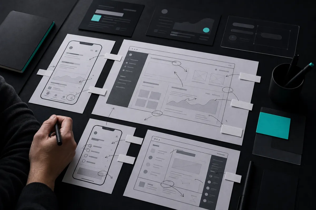
The old homepage with our annotations, every section scored against the visitor's first question.
Page Order
What it is, who it is for, the proof, then the paths. One order, the first question answered first.
What We Did Not Measure
Signups and conversion live in Lumen's analytics. We document the page; the numbers stay with them.
“They cut our homepage in half and it finally says what we do. We ship changes against their system now.”
Marketing lead, Lumen
Your Site