Proof Pages · All families
Reusable Sections
Eight sections, ready to drop in
Every section in the pack, shown in sequence. Import any one on its own, or combine them into new pages. They all share the same Divi 5 variables and presets.
Section 01
Masthead
Full-bleed hero with a proof rail. Opens any case study.
Meridian Dental Studio · Healthcare
Meridian New Patient Clarity
An anxious first-visit page became a calm, answer-first sequence the whole front desk can stand behind.
Meridian had gentle dentistry, modern rooms, and a kind team. The new-patient page was the gap: it led with the practice, not with the questions a nervous first-time patient actually carries through the door.
Client
Two-chair dental studio
Engagement
New patient page review, five weeks
Source Material
Front-desk calls, intake forms, new patient emails
Section 02
Snapshot and Stat Ledger
At-a-glance cards above a documented-number ledger.
Overview
The work at a glance
Where We Started
The page opened with awards and equipment. Patients were still calling to ask about insurance, first-visit length, and whether it would hurt.
What We Changed
We rebuilt the page around four things a new patient weighs first: cost and coverage, the first visit, comfort and anxiety, and getting started.
What We Measured
This review measured documentation and clarity. Booking volume and revenue depend on live practice data, so we left those numbers out.
Section 03
Challenge Band
The problem stated plainly, beside a source note.
The Challenge
The page reassured the practice, not the patient
Meridian's new-patient page opened with credentials, technology, and a smiling team. All true, all earned. But a first-time patient reading it still did not know what their visit would cost, how long it would take, or what the team does when someone is nervous. So they called, and the front desk answered the same four questions all morning.
Source Material
We worked from three weeks of front-desk call notes, the intake and insurance forms, new patient emails, and the practice language Meridian had already approved.
Section 04
Artifact Strip
Three captioned evidence frames in an even row.
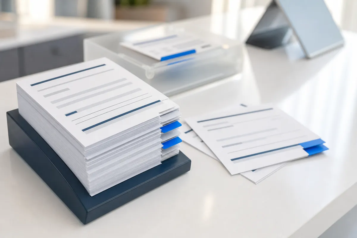
Artifact 01
New-patient call notes, grouped by the question behind each call

Artifact 02
Intake and insurance forms with our plain-language annotations
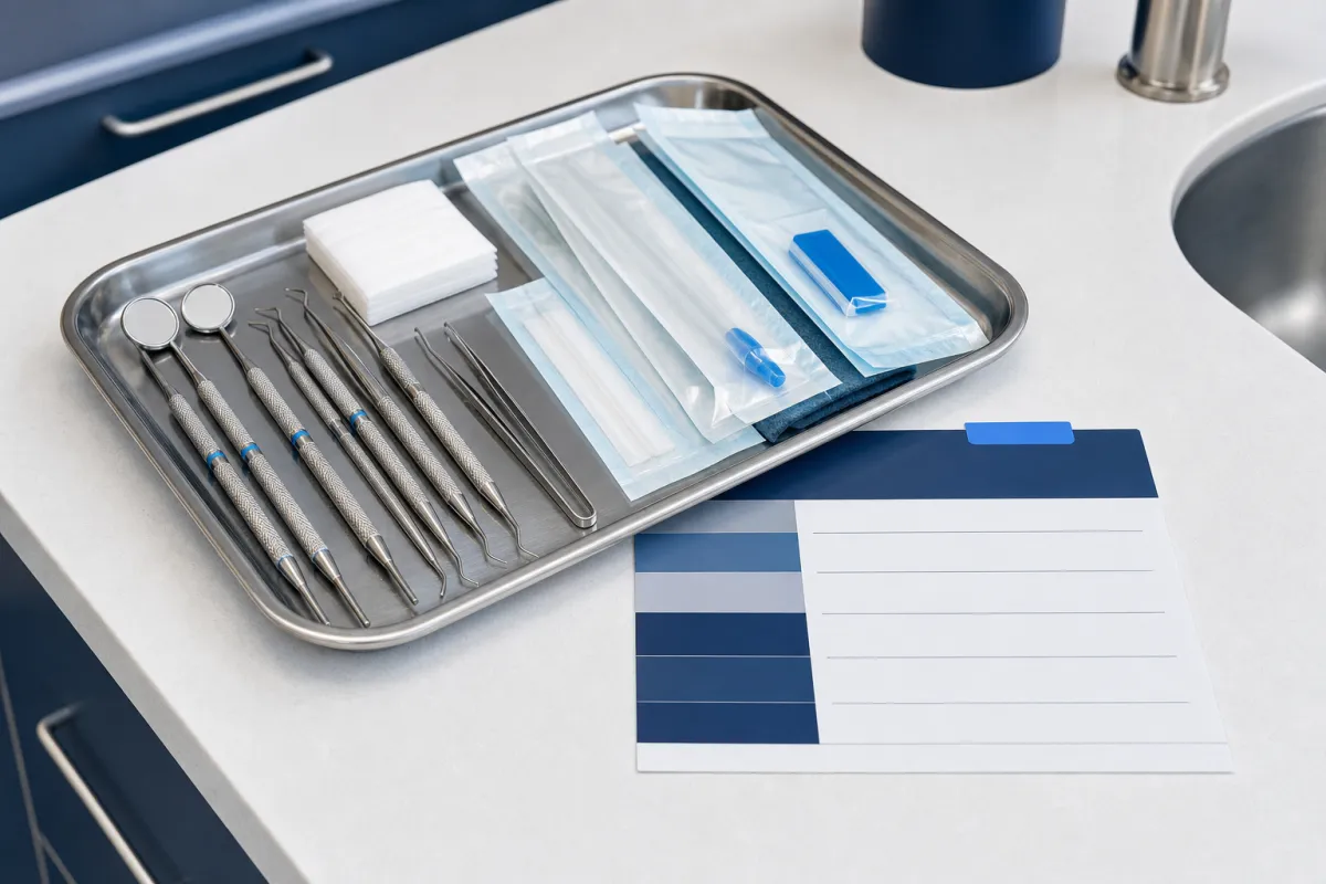
Artifact 03
First-visit walkthrough the hygienists described to us
Section 05
Process Steps
Equal-height numbered steps beside a media panel.

Chairside Motion
A calm clinical loop stands in for the practice's own waiting-room footage.
Our Approach
We organized the page around the first call
We listened to what new patients asked before they booked, then grouped the page around the four worries that came up every time: what it costs, what the first visit is like, how the team handles anxiety, and how to start. The goal was never a louder promise. It was a page that answered the phone before the phone rang.
1
Gathered new-patient calls, intake forms, and insurance notes.
2
Grouped repeated questions into cost, first visit, comfort, and starting.
3
Reviewed where each answer lived, and where patients expected it.
4
Drafted a calmer new-patient page in answer-first order.
5
Delivered a front-desk playbook matched to the page.
Section 06
Evidence Frame
A large interface frame with supporting proof cards.
The Evidence
The evidence behind the calmer page
We kept observed evidence separate from outcomes that only the practice's live booking data can verify.
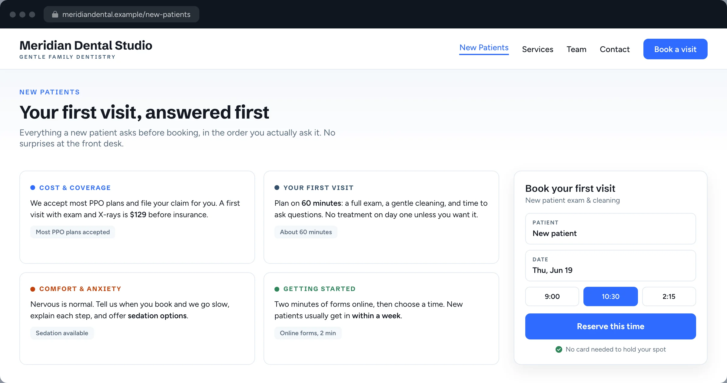
The reorganized new-patient page as patients now read it: cost and coverage, the first visit, comfort and anxiety, and getting started, in one calm sequence.
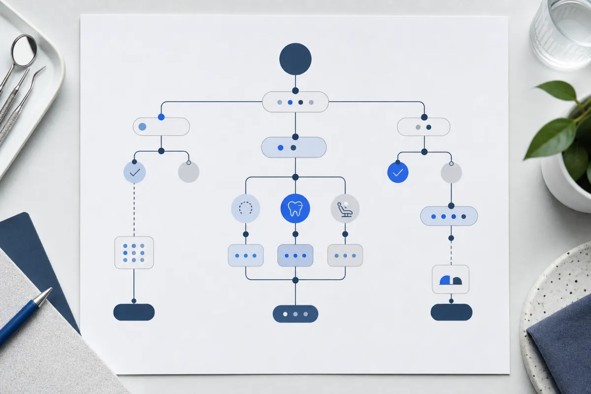
Question Map
How recurring new-patient calls grouped into four answer areas and one booking step.
Question Map
The new page order follows how a nervous patient actually decides: money, the visit, comfort, then the first step.
Answer Path
Insurance, first-visit length, sedation options, and new patient forms now move through one sequence instead of four scattered pages.
What We Did Not Measure
New bookings, chair utilization, and revenue sat outside this review. Those belong to verified practice data, so we left them out.
Section 07
Quote and Outcome
A reflection closed by a spined pull-quote.
Reflection
One page order the front desk could explain
By the end of the review, the front-desk team had one new-patient page they could walk a caller through in a single pass, and a short playbook that matched it word for word. The revised page, the call notes behind it, and the team reflection below are the record of that work.
“Now the page answers the questions we used to answer twenty times a day. New patients arrive already calmer.”
Practice manager, Meridian Dental Studio
Section 08
Handoff and CTA Band
The design-system pitch and closing call to action.
Inside the System
Built on a real Divi 5 design system
Every color, type size, spacing step, and component on this page is a named Divi 5 variable or preset. Change one and the whole story restyles, so making it yours is an edit, not a rebuild.
Design Variables
Change one color or type scale in the Variable Manager and the entire page follows. Nothing here is hardcoded, so your rebrand takes minutes.
Element Presets
Mastheads, proof rails, evidence frames, quote panels, and buttons all run on named presets. Restyle one and every match updates with it.
Rows That Stay Even
Card rows hold equal heights no matter how long your content runs. Paste your real copy and the layout keeps its shape on every screen.
Ready For Your Story
The sample case study, labels, and images are isolated for clean swaps. Drop in your own work without untangling a single style.