Proof Pages · All families
Reusable Sections
Eight sections, ready to drop in
Every section in the pack, shown in sequence. Import any one on its own, or combine them into new pages. They all share the same Divi 5 variables and presets.
Section 01
Masthead
Full-bleed hero with a proof rail. Opens any case study.
Priya Nair × Vela · Onboarding Redesign
Vela, an Onboarding People Finish
A budgeting app where most new accounts stalled before the first real screen got an onboarding rebuilt around one honest promise, and a flow people actually complete.
Vela helps people budget, but its sign-up asked for everything up front: eleven steps, six permission prompts, and a goal wizard before anyone saw a single number. I rebuilt it around the first thing a new user actually wants to reach.
Client
Vela, personal finance app
Engagement
Product and UX design, eight weeks
Scope
Onboarding flow, design system, prototype
Section 02
Snapshot and Stat Ledger
At-a-glance cards above a documented-number ledger.
Overview
The work at a glance
Where We Started
Eleven onboarding steps, six permission prompts, and a goal wizard before a single account was connected. Most new users left on the second screen.
What We Changed
Four steps to a first real number, permissions asked only at the moment they pay off, and goal setting moved to after the value, not before it.
What We Measured
I tested completion in a moderated prototype study. Activation and retention live in Vela's own analytics, so those numbers stay with them.
Section 03
Challenge Band
The problem stated plainly, beside a source note.
The Challenge
Eleven steps before a single number
Vela's product was good once you were inside it. Getting inside was the problem. Sign-up ran eleven screens deep, asked for camera, contacts, and notification permissions before showing why, and made every new person build a savings goal for money the app had not seen yet. People who downloaded a budgeting app to see their money were asked to do homework instead. The brief was to get a new user to their first real, useful number as fast as honesty allowed, and to make the rest of the flow earn each thing it asked for.
Source Material
I worked from a stack of session recordings of real sign-ups, the analytics on where people dropped, the permission prompts and the platform rules behind them, and eight moderated interviews with people who had abandoned the app.
Section 04
Artifact Strip
Three captioned evidence frames in an even row.
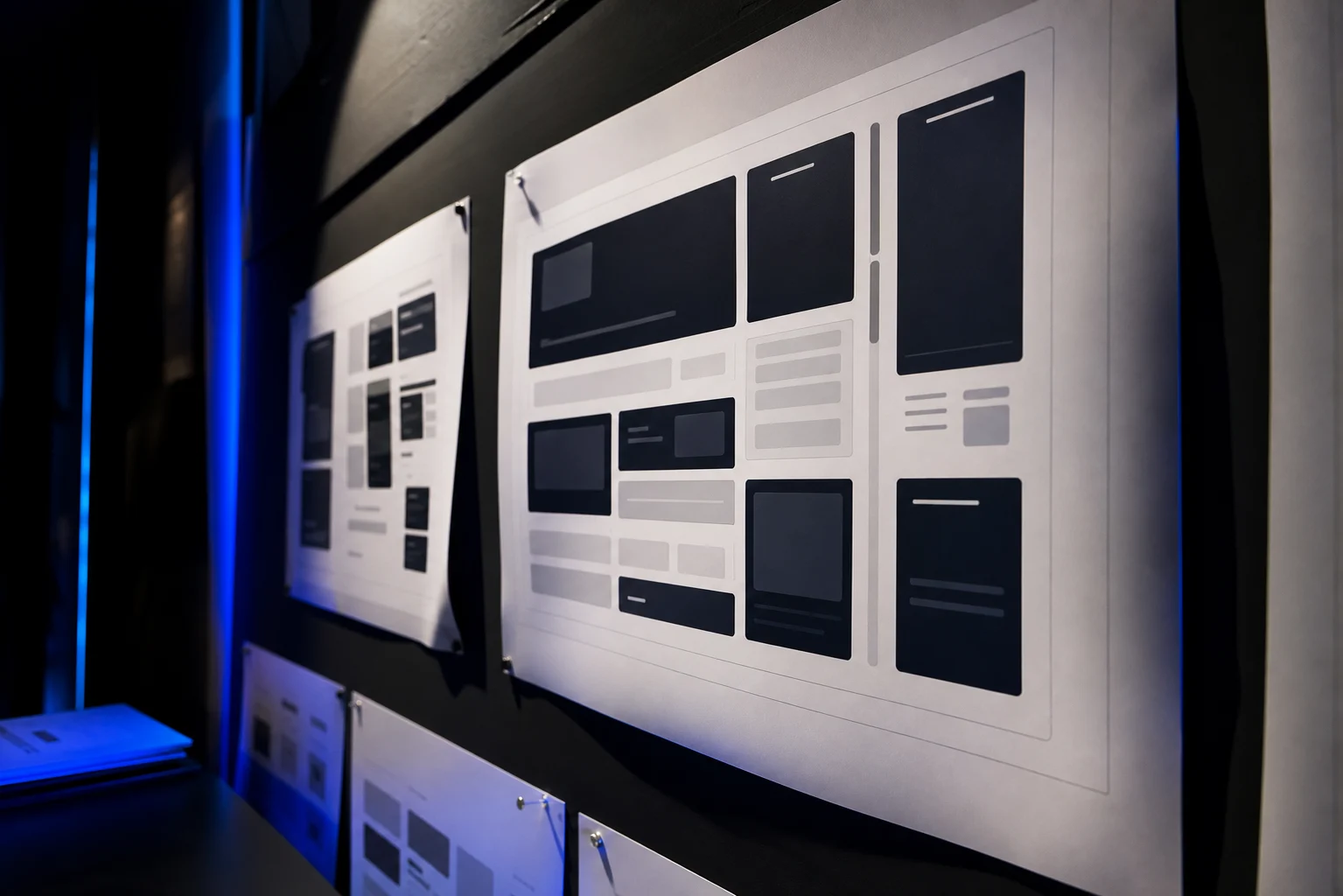
Artifact 01
The old eleven step flow, screen by screen, tagged with where people quit
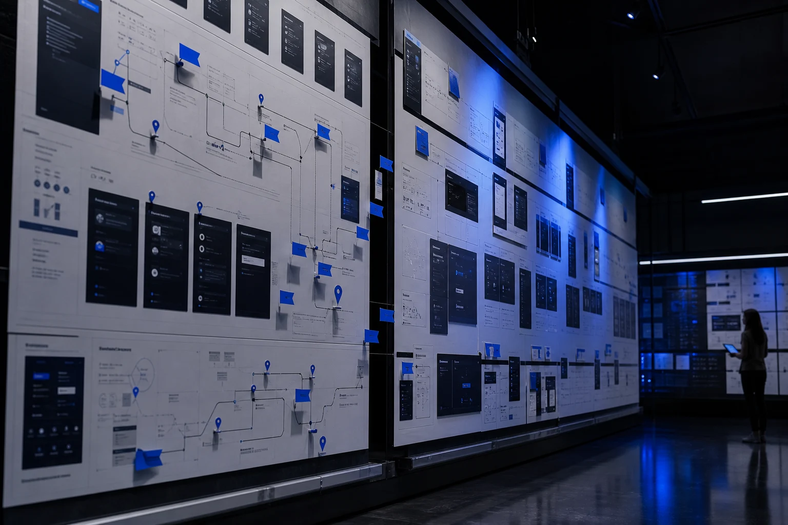
Artifact 02
Drop-off notes from session recordings, sorted by the moment of friction
Artifact 03
The four step flow, sketched against the one number it leads to
Section 05
Process Steps
Equal-height numbered steps beside a media panel.

In Motion
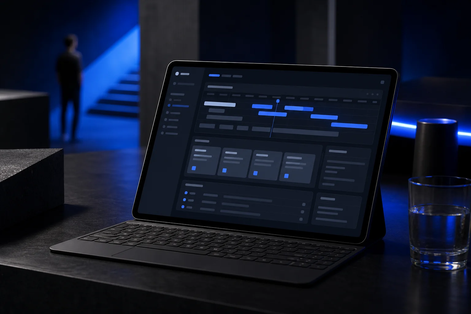
A motion study stands in for the prototype, walking the new four step flow end to end.
The Approach
I rebuilt it around the first real number
I found the single screen that made the app feel worth keeping, the first view of real spending, and worked backward to the shortest honest path there. I cut every step that did not serve that moment, moved permissions to where they earn their keep, and held goal setting until after the user had seen their own money. Then I built it as a small design system so the team could extend the flow without it drifting.
1
Watched real sign-ups and tagged every drop-off moment.
2
Found the first screen that made the app feel worth keeping.
3
Cut the flow back to the shortest honest path to it.
4
Moved each permission to where it actually pays off.
5
Shipped it as a small design system the team owns.
Section 06
Evidence Frame
A large interface frame with supporting proof cards.
The Evidence
The flow, end to end
What I designed and prototyped. Activation and retention live in Vela's own analytics, not mine.
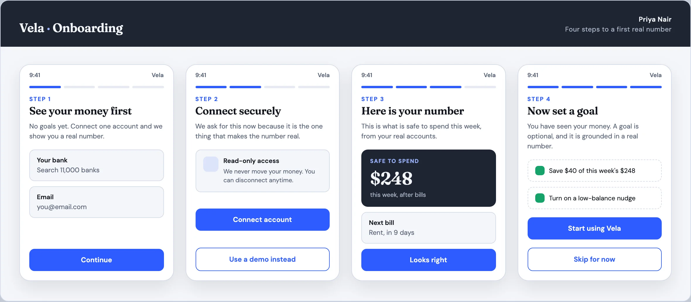
The Vela onboarding as it ships: four steps to a first real number, a connect screen that explains itself, and goal setting held until the user has seen their own money.

Flow Map
How eleven screens and six early permission prompts became four steps to a useful first number.
The Flow
Four steps to a real number, each one earning the next. Nothing is asked before the user can see why it helps them.
A System, Not A Screen
The flow ships as named components and tokens, so the team adds a step or restyles the set without the design drifting.
What I Did Not Measure
Activation, retention, and revenue sit in Vela's analytics, not mine. I document the design and the prototype tests; the outcomes stay with the client.
Section 07
Quote and Outcome
A reflection closed by a spined pull-quote.
Reflection
An onboarding that respects the user's time
New users reach a real, useful number in four steps now, and the team extends the flow from a system instead of redrawing it. The prototype, the flow map behind it, and the product lead's note below are the record of the work.
“Priya found the one screen that made our app worth keeping and built the shortest honest path to it. New people get there now instead of leaving.”
Head of Product, Vela
Section 08
Handoff and CTA Band
The design-system pitch and closing call to action.
Inside the System
Built on a real Divi 5 design system
Every color, type size, spacing step, and component on this page is a named Divi 5 variable or preset. Change one and the whole story restyles, so making it yours is an edit, not a rebuild.
Design Variables
Change one color or type scale in the Variable Manager and the entire page follows. Nothing here is hardcoded, so your rebrand takes minutes.
Element Presets
Mastheads, proof rails, evidence frames, quote panels, and buttons all run on named presets. Restyle one and every match updates with it.
Rows That Stay Even
Card rows hold equal heights no matter how long your content runs. Paste your real copy and the layout keeps its shape on every screen.
Ready For Your Story
The sample case study, labels, and images are isolated for clean swaps. Drop in your own work without untangling a single style.