Proof Pages · All families
Bayline House · Hospitality
Bayline Booking Clarity
A scattered guest journey became a clear booking story, with evidence the team could review at every step.
Bayline House had warm service, strong room photography, and useful guest guidance. The booking path was the problem: it asked visitors to connect too many details on their own.
Client
Boutique hospitality group
Engagement
Booking journey review, six weeks
Source Material
Guest questions, screen flows, staff notes
Overview
The work at a glance
Where We Started
Guests could see rooms, amenities, breakfast notes, and local options, but the order never matched how people decide whether a stay fits.
What We Changed
We rebuilt the page around four things guests actually weigh: room fit, stay experience, service details, and confidence notes.
What We Measured
This review measured documentation and clarity. Booking lift and revenue depend on live booking data, so we left those numbers out.
6
Week Engagement
4
Content Groups Defined
5
Review Steps Completed
1
Handoff Packet Delivered
The Challenge
The booking path felt harder than the stay
Guests could see the property, the rooms, and the amenities, but the path from interest to booking felt fragmented. Room details, breakfast notes, local experiences, and cancellation answers lived in separate places, and the front desk heard it in every follow-up call.
Source Material
We worked from booking screens, guest inquiry themes, lobby notes, and the property language Bayline had already approved.

Artifact 01
Guest inquiry cards, sorted by decision stage
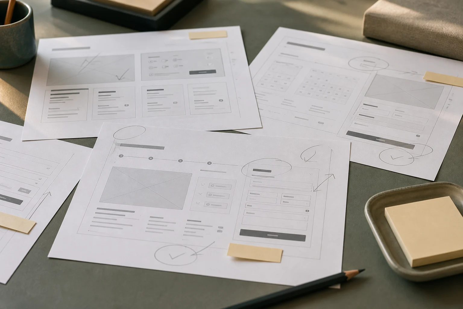
Artifact 02
Booking screens with our review annotations

Artifact 03
Front-desk service log and room sheets
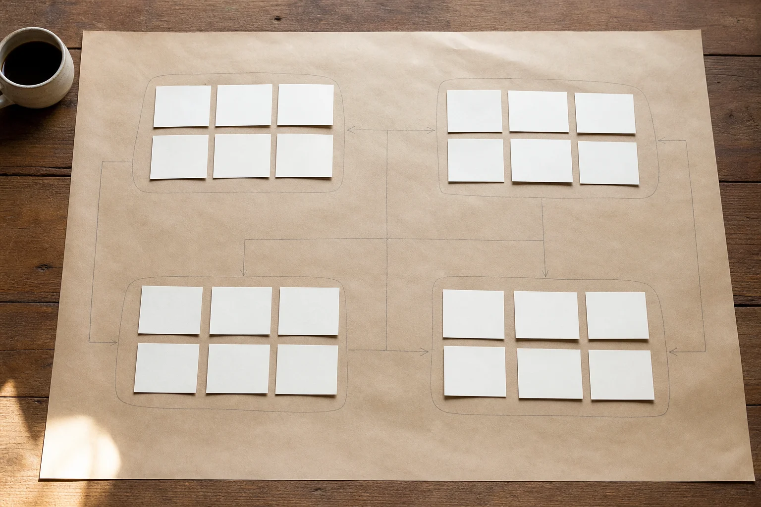
Optional Motion Slot
Static fallback: journey notes grouped from first question to booking handoff.
Our Approach
We organized the page around guest decisions
We mapped the questions guests asked before booking, then grouped the page content around room fit, stay experience, service details, and confidence notes. The goal was never a louder promise. It was a calmer path that let guests review what mattered before choosing a room.
1
Gathered booking screens, notes, and property materials.
2
Mapped repeated guest questions by decision stage.
3
Reviewed room, breakfast, and cancellation details.
4
Drafted a clearer sequence for the booking page.
5
Prepared a handoff packet with annotated evidence.
The Evidence
The evidence behind the new flow
We kept observed evidence separate from outcomes that only live booking data can verify.
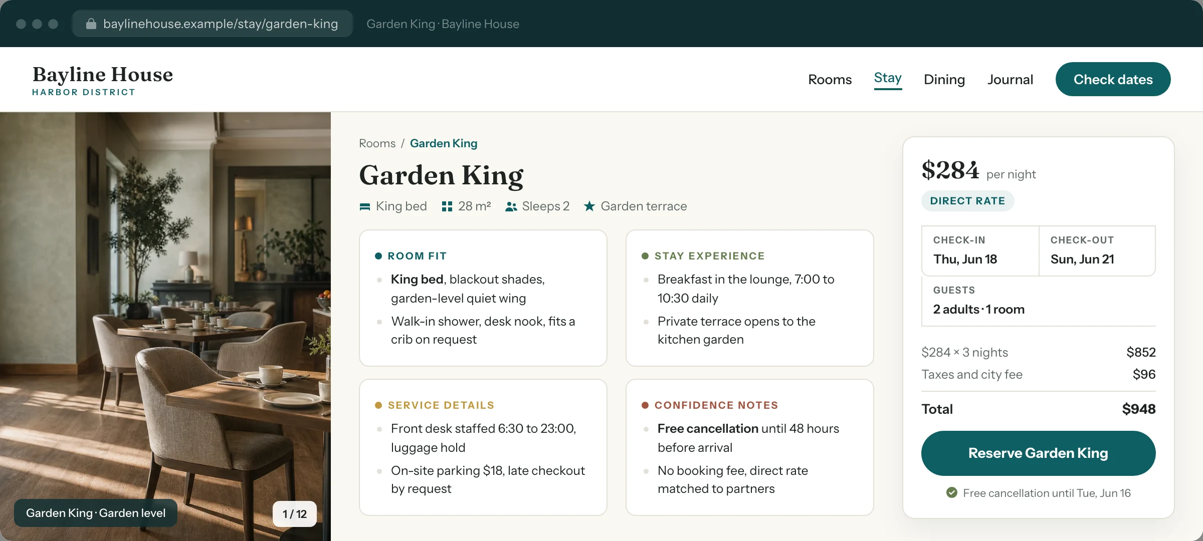
The reorganized booking path as guests now review it: room fit, stay experience, service details, and confidence notes in one sequence.
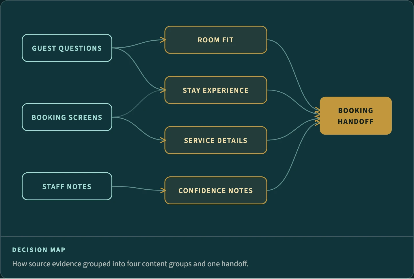
Decision Map
How the source evidence grouped into four content areas and one booking handoff.
Decision Map
The new page order follows how guests compare room fit, stay details, and next steps.
Review Path
Room intent, package options, service notes, and cancellation context now move through one sequence instead of five scattered pages.
What We Did Not Measure
Booking lift, revenue, and conversion sat outside this review. Those claims belong to verified booking data, so we left them out.
Reflection
One page order the team could explain
By the end of the review, the front-desk team had one page order they could explain in a single pass. The revised content path, the source notes, and the client reflection below are the record of that work.
“The new flow gave us a simple way to explain what guests needed to know first.”
Guest experience lead, Bayline House
Inside the System
Built on a real Divi 5 design system
Every color, type size, spacing step, and component on this page is a named Divi 5 variable or preset. Change one and the whole story restyles, so making it yours is an edit, not a rebuild.
Design Variables
Change one color or type scale in the Variable Manager and the entire page follows. Nothing here is hardcoded, so your rebrand takes minutes.
Element Presets
Mastheads, proof rails, evidence frames, quote panels, and buttons all run on named presets. Restyle one and every match updates with it.
Rows That Stay Even
Card rows hold equal heights no matter how long your content runs. Paste your real copy and the layout keeps its shape on every screen.
Ready For Your Story
The sample case study, labels, and images are isolated for clean swaps. Drop in your own work without untangling a single style.